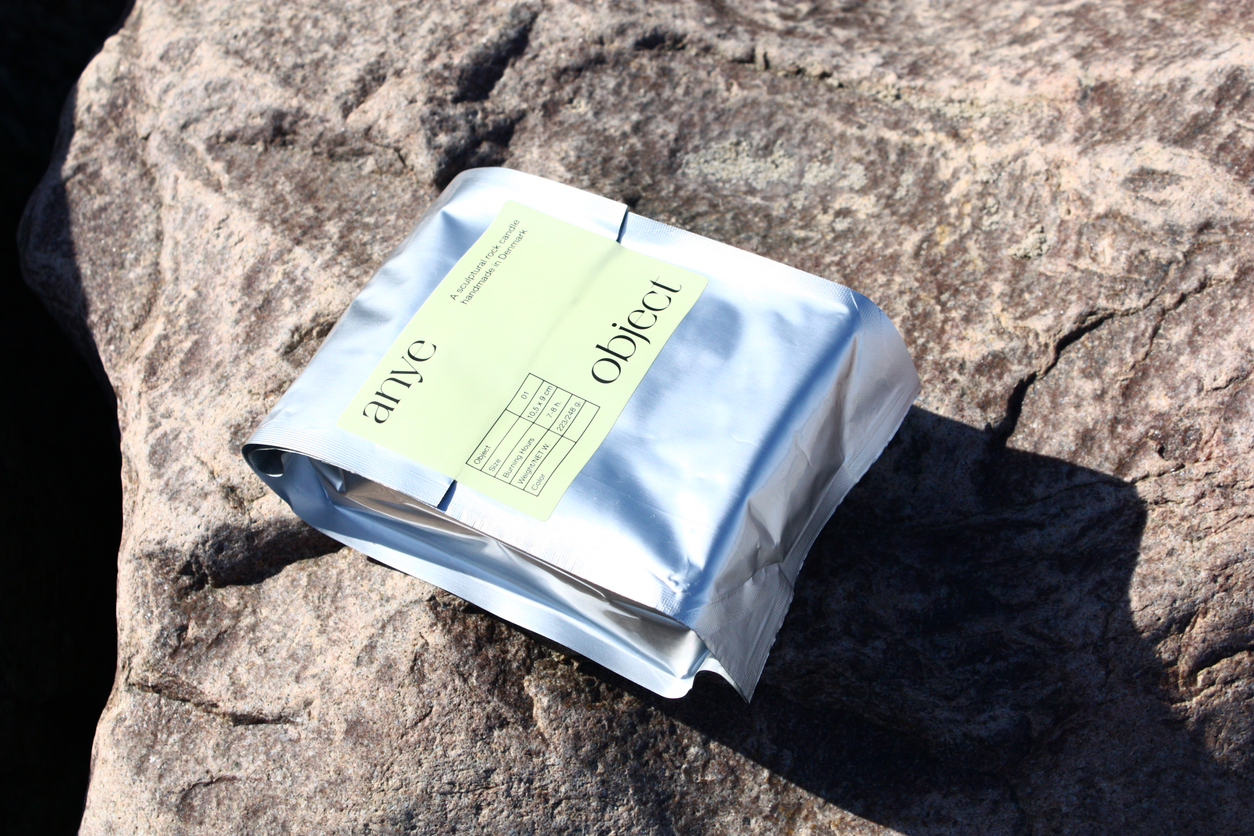
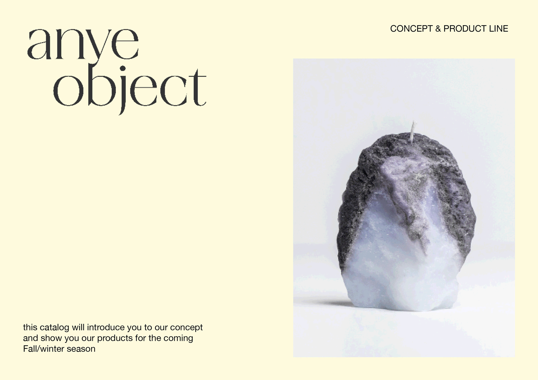
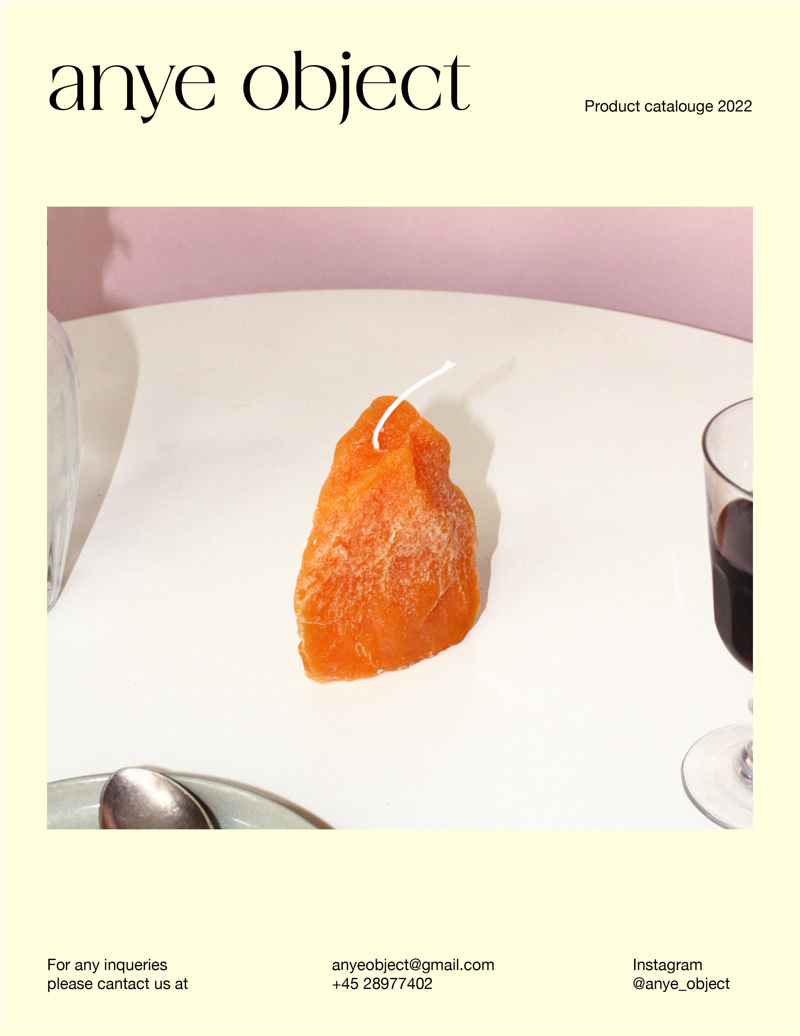
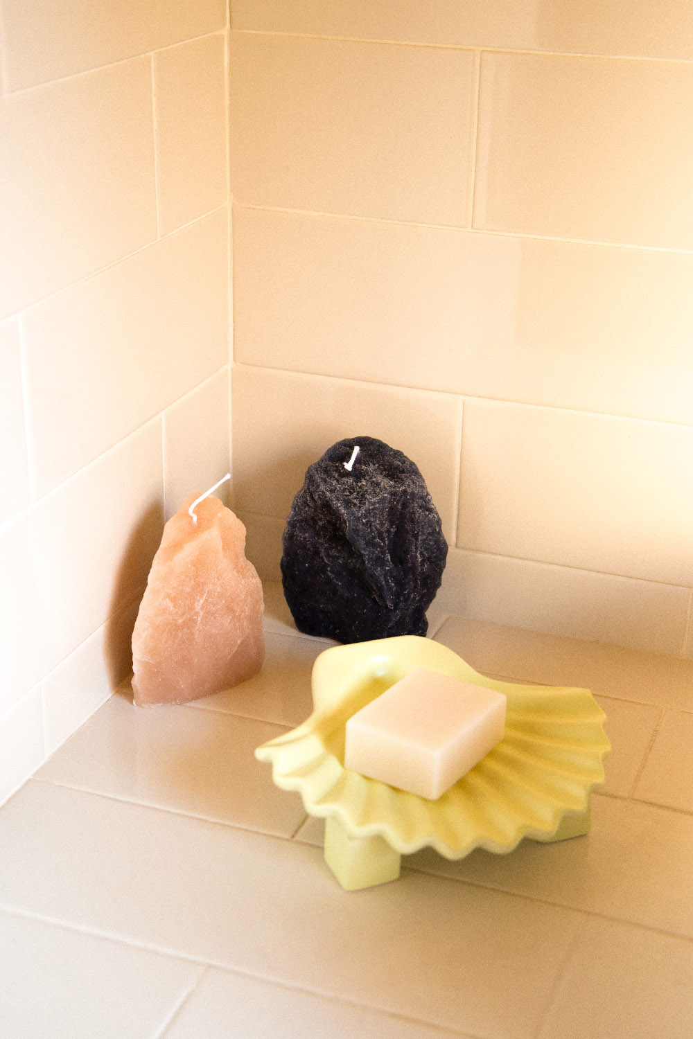
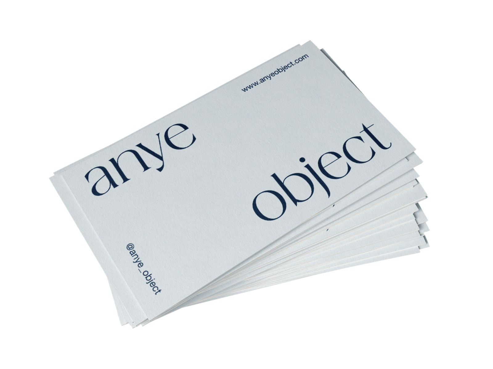
ANYE OBJECT
I was involved in creating the product and building a brand with a visual identity and website. I was responsible for the visual communication, including creating marketing materials such as social media content and point-of-sale materials. The visual identity features a tight grid, with a design focused on a few key elements paired with an organic typeface. The typeface has a light feel but sharp, pointed edges—reminiscent of stones and rocks. Altogether, the solution aims to evoke a Nordic aesthetic with a clean, organic feeling.
 .
. 

.
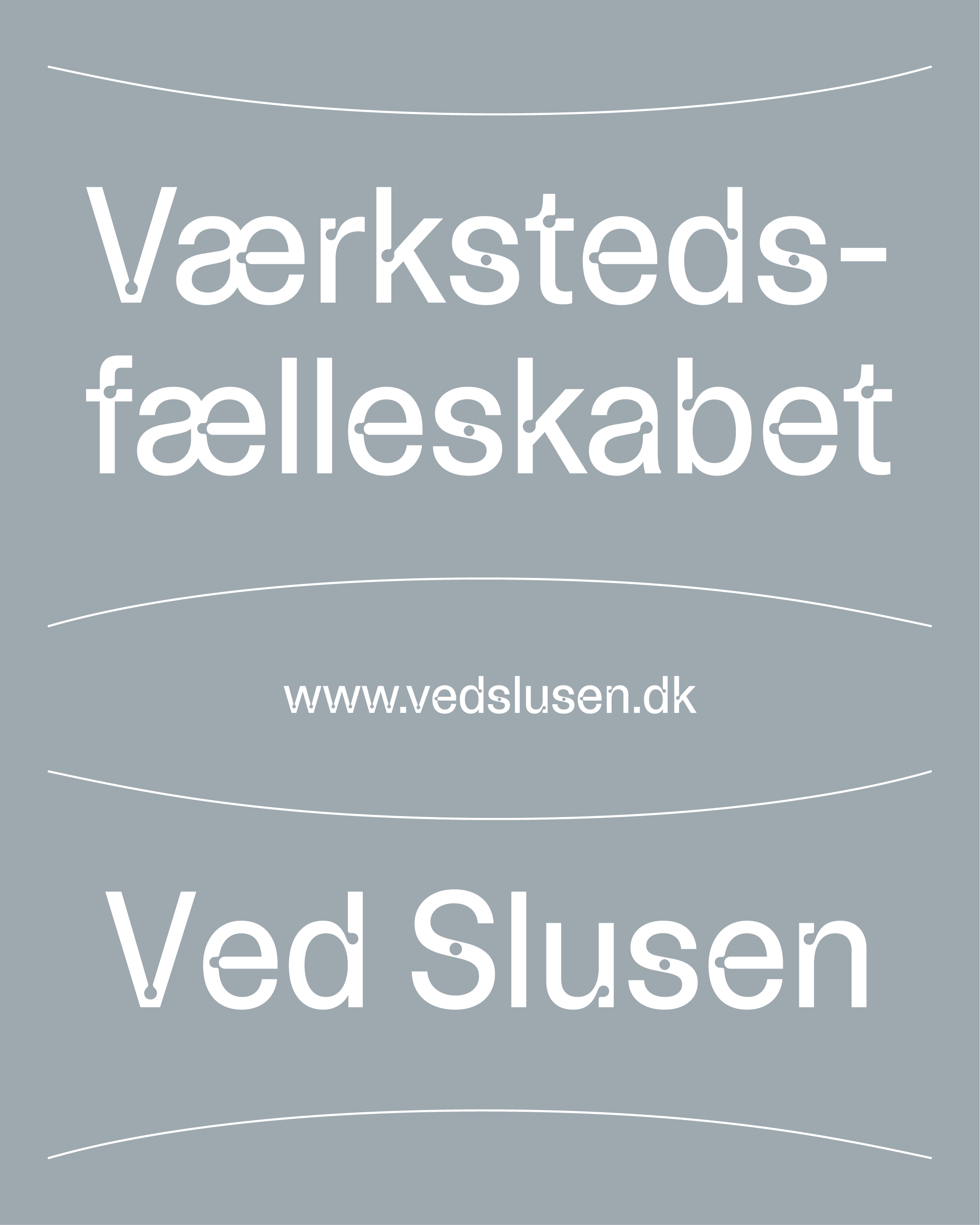
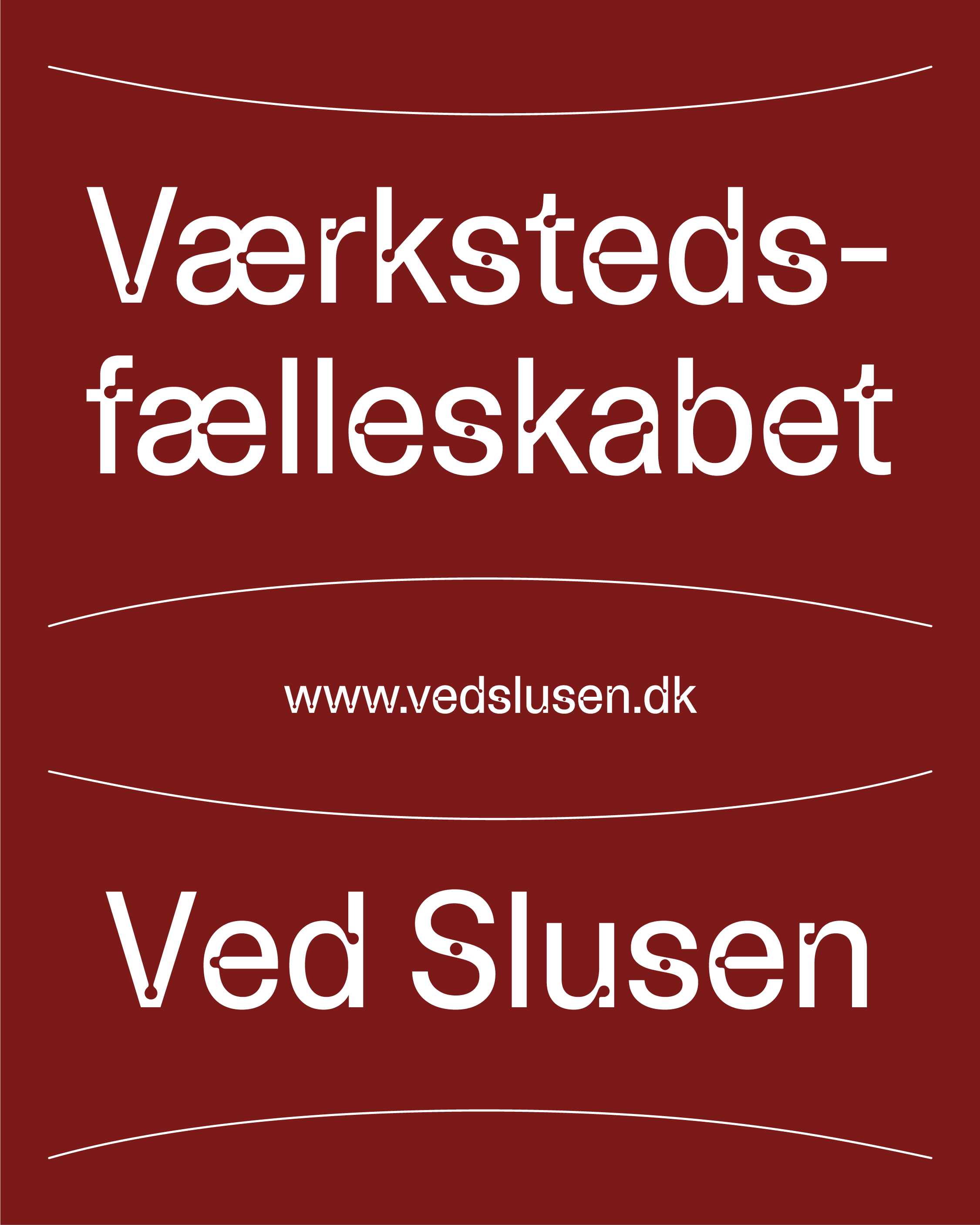
VÆRKSTEDSFÆLLESKABET VED SLUSEN
An association of craftsmen, architects, and professionals from various fields. A simple identity takes inspiration from the concept of craftsmanship and the association's location near a sea lock. The drawing lines and 'nail holes,' originally ink traps in the typography, create a strong sense of a dynamic environment, symbolizing the movement and development inherent in the process of building something.
Category: visual identity, webdesign
Link: www.vedslusen.dk
Year: 2024
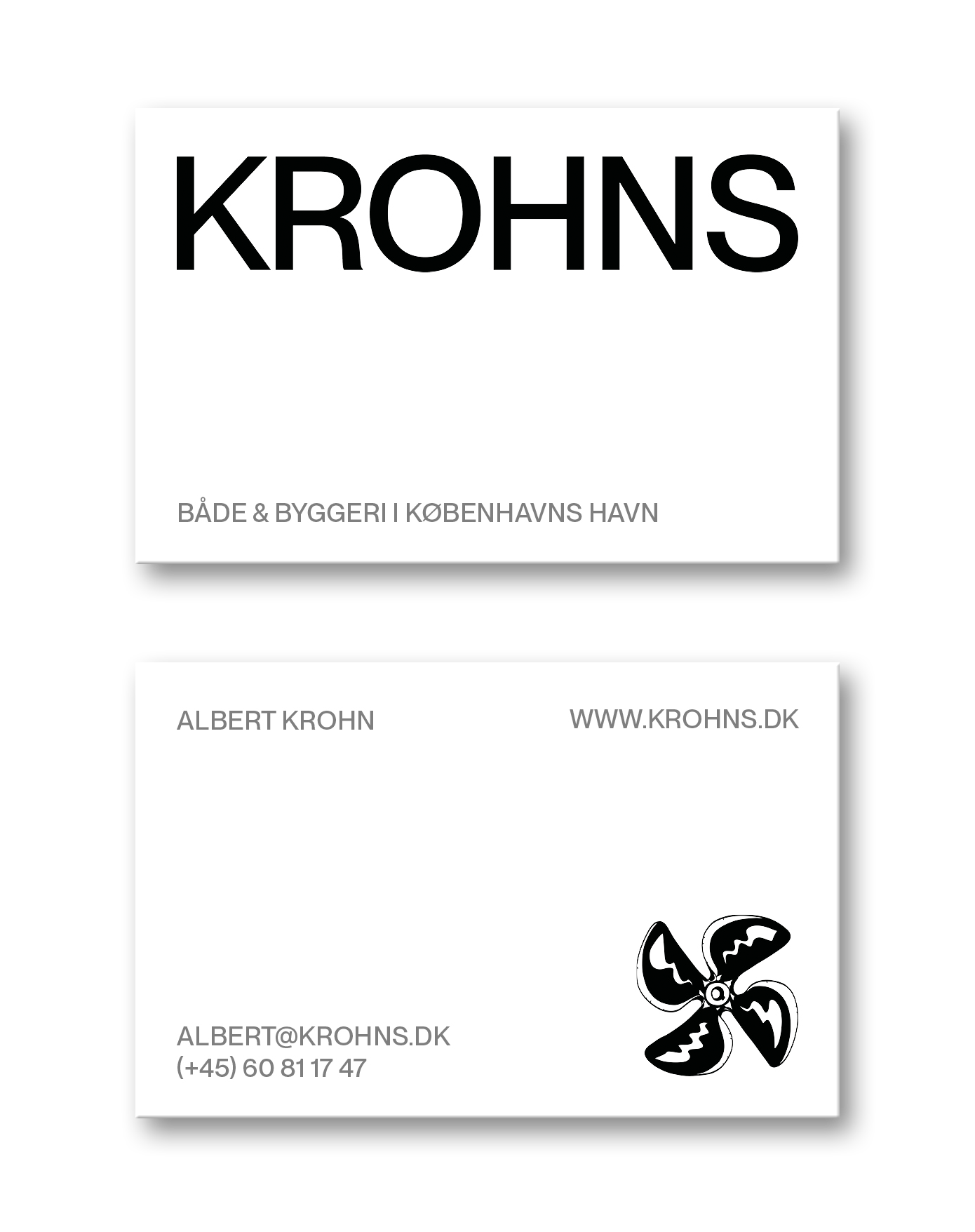
KROHNS
KROHNS ApS has more than 10 years of experience in building houseboats, carpentry, and interior solutions. The goal was to create a new website and update the company's visual identity. The visual identity focuses on establishing a maritime atmosphere combined with a clean aesthetic, reflecting the simplicity and high quality of the craftsmanship. Logo-mark is originally drawn by Halfdan Pisket.
Category: visual identity, webdesign and stationary
Link: www.krohns.dk
Year: 2024


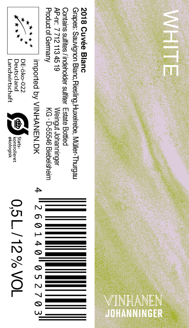
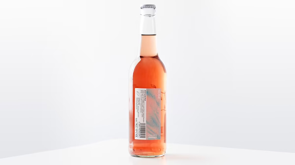
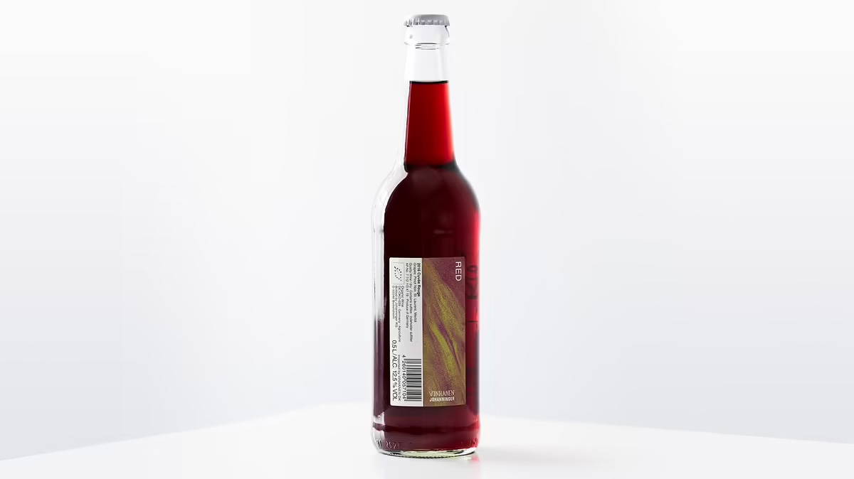
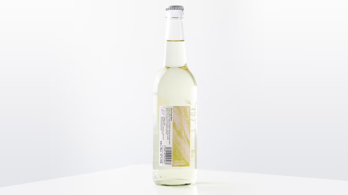
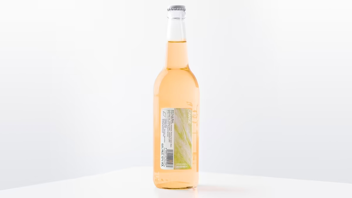
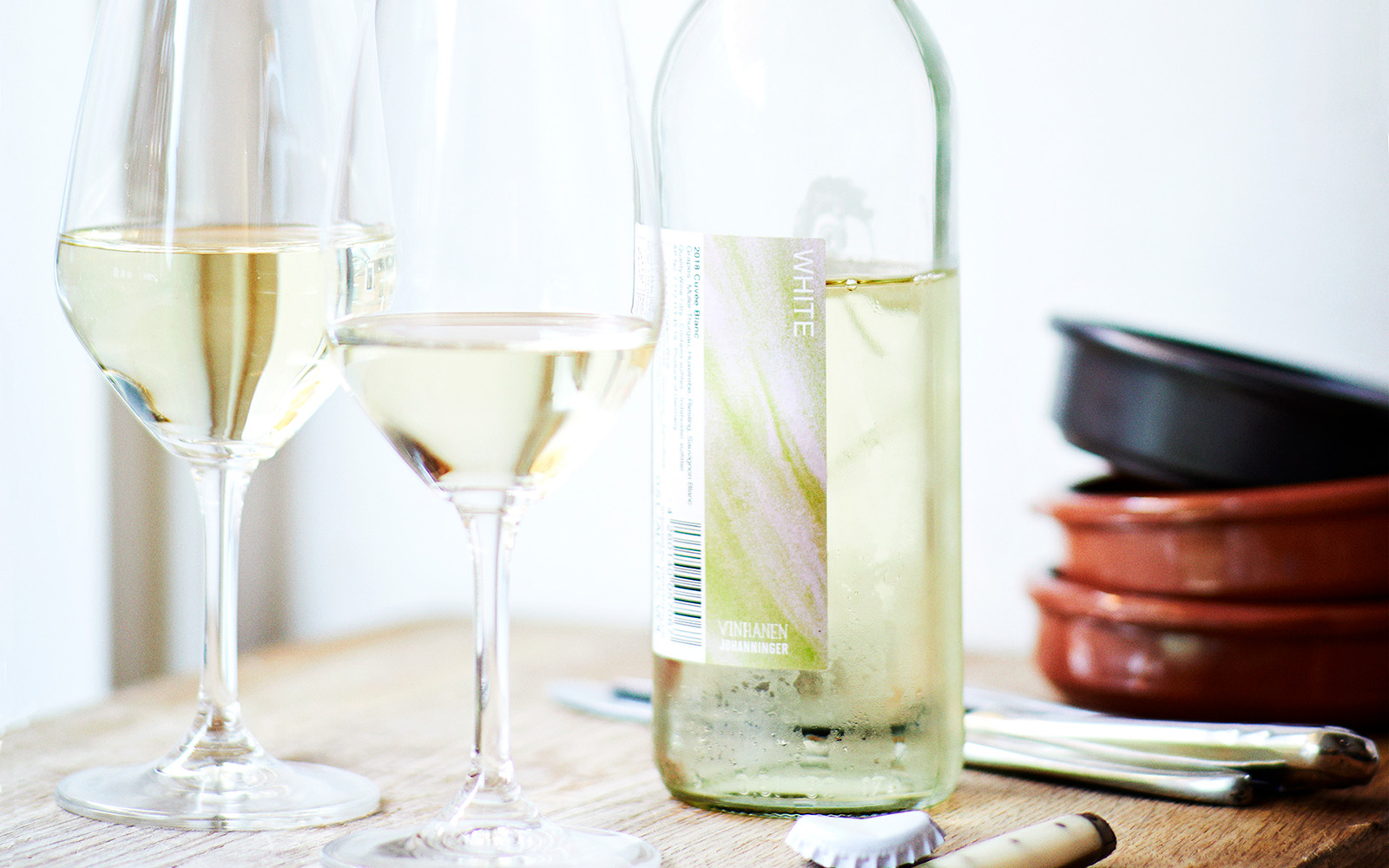
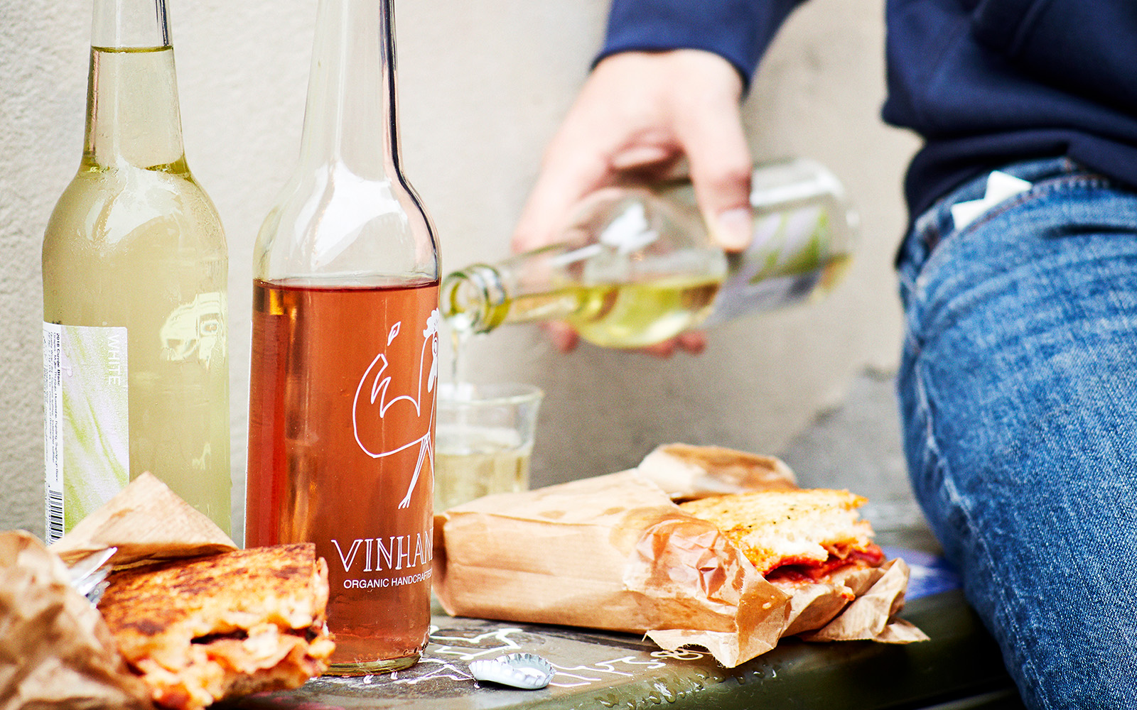
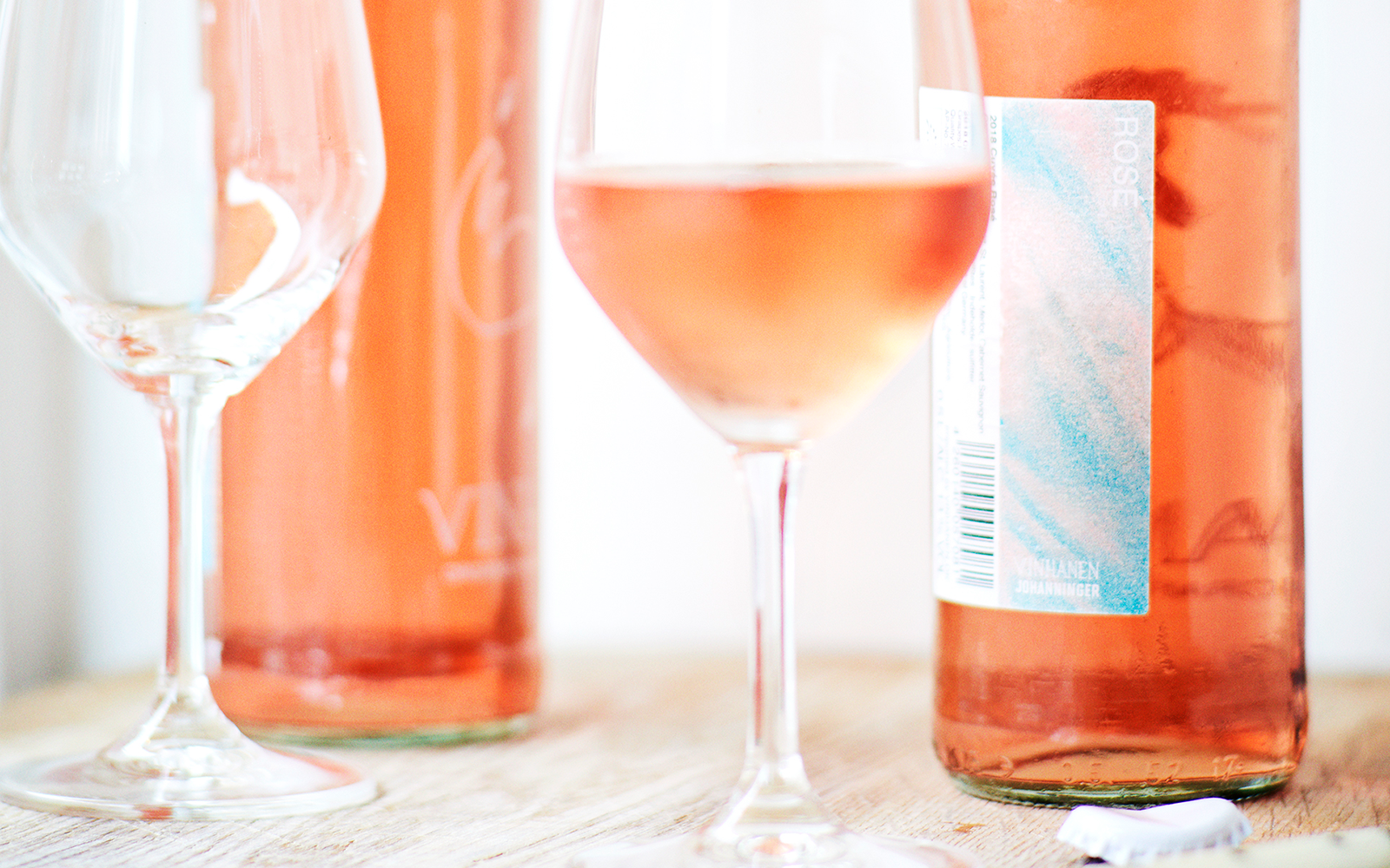
VINNHANEN
Packaging design for the first edition of their small wine bottle concept, created for the Copenhagen-based wine brand Vinhanen. The solution is centered around the many colors that appear during the various phases of wine production and should give a fresh and appealing feeling .
Category: packaging design, label design
Year: 2021


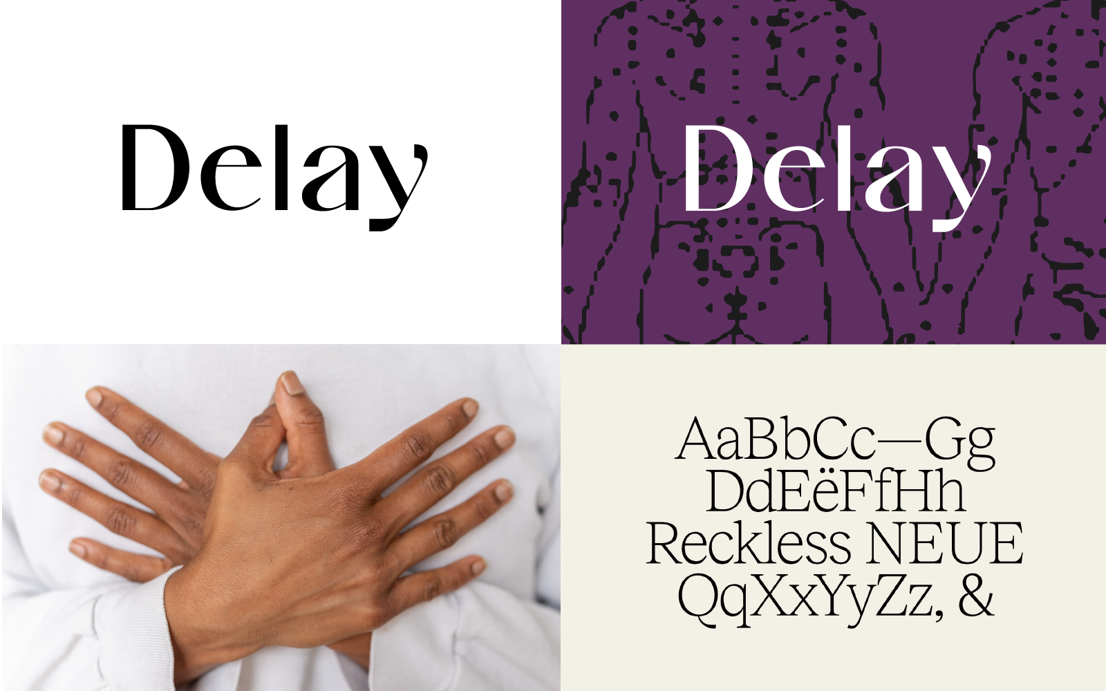
DELAY
Visual identity and website for a Copenhagen-based therapy practice. The identity is inspired by human connection—holding hands, slowing down, and illustrating the pathways and zones of the nervous system.
Category: visual identity, webdesign,
SoMe-content
Year: 2022